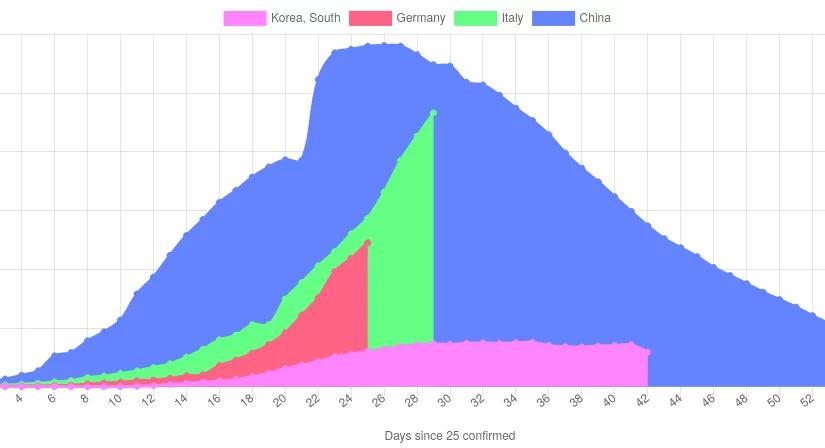
I am quite frustrated with corona graphs in the news, since most reporters seem to have skipped math classes back then. For instance, just plotting the number of confirmed infections at the respective dates does not tell you anything due to the different time point of outbreak. So lets see whether I can do better:
https://paroj.github.io/arewedeadyet/
With the site above, I tried to improve on a few things:
- the Charts are live: they update themselves each time you load the site.
- The curves are normalized by the time-point of outbreak so you can compare the course in different countries.
- You can select the countries that you want to compare.
- Different metrics are computed that allow comparing the corona countermeasures and impact across countries with different population size.